Intro to matplotlib
Contents
4. Intro to matplotlib
4.1. Intro
4.1.1. fig, ax, & plt.subplots()
import matplotlib.pyplot as plt
import pandas as pd
先來介紹 oo 的寫法
一率先用
fig, ax = plt.subplots()當開頭fig 是 container which hold everything you see on the page
ax 是 part of the page that holds data, it is the canvas
所以,在我們還沒有 assign data 給 ax 前,畫出來的圖,就是白的:
fig, ax = plt.subplots() # subplots 裡面沒寫參數,預設就是 1 ,表示你只要畫 1 張 subplot
plt.show()
接著,我們把 data 加進 ax 裡面
seattle_weather = pd.read_csv("data/seattle_weather.csv")
sub_data = seattle_weather.loc[seattle_weather.STATION == "USC00456295"]
sub_data.loc[:, ["DATE","MLY-PRCP-NORMAL"]] # prcp = precipitation (inches) 的縮寫,雨量
| DATE | MLY-PRCP-NORMAL | |
|---|---|---|
| 0 | 1 | 11.03 |
| 1 | 2 | 7.74 |
| 2 | 3 | 9.08 |
| 3 | 4 | 7.37 |
| 4 | 5 | 6.39 |
| 5 | 6 | 5.34 |
| 6 | 7 | 2.55 |
| 7 | 8 | 2.56 |
| 8 | 9 | 3.95 |
| 9 | 10 | 7.29 |
| 10 | 11 | 12.58 |
| 11 | 12 | 9.85 |
adding data to axes
fig, ax = plt.subplots()
ax.plot(sub_data["DATE"], sub_data["MLY-PRCP-NORMAL"])
[<matplotlib.lines.Line2D at 0x120efd5b0>]
那如果我想在這張圖上,再加上其他的 line ,我該怎麼做呢?
答案是:一直
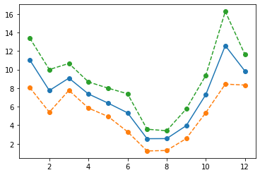
ax.plot()下去就好例如剛剛這條線,我在資料中,還有 PR25, PR75 的資料,所以我可以畫出這個區間:
fig, ax = plt.subplots()
ax.plot(sub_data["DATE"], sub_data["MLY-PRCP-NORMAL"])
ax.plot(sub_data["DATE"], sub_data["MLY-PRCP-25PCTL"])
ax.plot(sub_data["DATE"], sub_data["MLY-PRCP-75PCTL"])
[<matplotlib.lines.Line2D at 0x1210de190>]
不錯,有上下限了,但不太美觀,下一節開始 customize 一些細節
4.1.2. customize
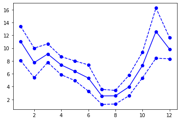
但因為這張圖,資料點其實只出現在 “月份” 上,所以最好加上 marker ,讓讀者知道資料出現在哪
fig, ax = plt.subplots()
ax.plot(sub_data["DATE"], sub_data["MLY-PRCP-NORMAL"], marker = "o")
ax.plot(sub_data["DATE"], sub_data["MLY-PRCP-25PCTL"], marker = "o")
ax.plot(sub_data["DATE"], sub_data["MLY-PRCP-75PCTL"], marker = "o")
[<matplotlib.lines.Line2D at 0x1210f08b0>]
我們也可以改變線條的 linestyle:
fig, ax = plt.subplots()
ax.plot(sub_data["DATE"], sub_data["MLY-PRCP-NORMAL"], marker = "o")
ax.plot(sub_data["DATE"], sub_data["MLY-PRCP-25PCTL"], marker = "o", linestyle = "--")
ax.plot(sub_data["DATE"], sub_data["MLY-PRCP-75PCTL"], marker = "o", linestyle = "--")
[<matplotlib.lines.Line2D at 0x1211a8850>]
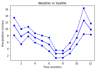
也可以改顏色
fig, ax = plt.subplots()
ax.plot(sub_data["DATE"], sub_data["MLY-PRCP-NORMAL"], marker = "o", color = "blue")
ax.plot(sub_data["DATE"], sub_data["MLY-PRCP-25PCTL"], marker = "o", color = "blue", linestyle = "--")
ax.plot(sub_data["DATE"], sub_data["MLY-PRCP-75PCTL"], marker = "o", color = "blue", linestyle = "--")
[<matplotlib.lines.Line2D at 0x121214a30>]
改 x label, y label, title
fig, ax = plt.subplots()
ax.plot(sub_data["DATE"], sub_data["MLY-PRCP-NORMAL"], marker = "o", color = "blue")
ax.plot(sub_data["DATE"], sub_data["MLY-PRCP-25PCTL"], marker = "o", color = "blue", linestyle = "--")
ax.plot(sub_data["DATE"], sub_data["MLY-PRCP-75PCTL"], marker = "o", color = "blue", linestyle = "--")
ax.set_xlabel("Time (months)");
ax.set_ylabel("Precipitation (inches)")
ax.set_title("Weather in Seattle");
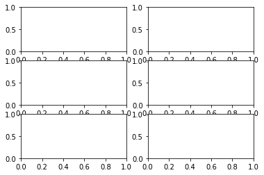
4.1.3. small multiples
fig, ax = plt.subplots(3, 2)
plt.show()
此時,ax 變成 array object,可以確認看看:
ax.shape
(3, 2)
所以,我等等要畫圖時,我要指名我要對 ax 這個 array 中的哪個 ax 畫圖
例如,我要對 (0,0) 畫圖,那就要寫
ax[0,0].plot()
fig, ax = plt.subplots(3,2)
ax[0,0].plot(sub_data["DATE"], sub_data["MLY-PRCP-NORMAL"], marker = "o", color = "blue")
ax[0,0].plot(sub_data["DATE"], sub_data["MLY-PRCP-25PCTL"], marker = "o", color = "blue", linestyle = "--")
ax[0,0].plot(sub_data["DATE"], sub_data["MLY-PRCP-75PCTL"], marker = "o", color = "blue", linestyle = "--")
ax[0,0].set_xlabel("Time (months)");
ax[0,0].set_ylabel("Precipitation (inches)")
ax[0,0].set_title("Weather in Seattle");
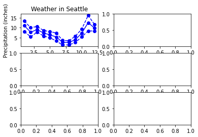
要注意的是,如果你的 subplot 只有一行或一列,那 ax 會退化到 1d array (而不是剛剛的 2d array)
fig, ax = plt.subplots(2,1) # 畫出 2 列 1 行
ax.shape
fig, ax = plt.subplots(1,2) # 畫出 1 列 2 行
ax.shape
(2,)
所以在畫圖時,就要用
ax[0].plot,ax[1].plot來指定畫圖舉例來說,我取兩個城市的資料來畫圖:
seattle_weather = pd.read_csv("data/seattle_weather.csv")
austin_weather = pd.read_csv("data/austin_weather.csv")

seattle_sub = seattle_weather.loc[seattle_weather.STATION == "USC00456295"]
austin_sub = austin_weather.loc[austin_weather.STATION == "USW00013904"]
fig, ax = plt.subplots(2,1) # 畫出 2 列 1 行

ax[0].plot(seattle_sub["DATE"], seattle_sub["MLY-PRCP-NORMAL"], marker = "o", color = "blue")
ax[0].plot(seattle_sub["DATE"], seattle_sub["MLY-PRCP-25PCTL"], marker = "o", color = "blue", linestyle = "--")
ax[0].plot(seattle_sub["DATE"], seattle_sub["MLY-PRCP-75PCTL"], marker = "o", color = "blue", linestyle = "--")

ax[1].plot(austin_sub["DATE"], austin_sub["MLY-PRCP-NORMAL"], marker = "o", color = "red")
ax[1].plot(austin_sub["DATE"], austin_sub["MLY-PRCP-25PCTL"], marker = "o", color = "red", linestyle = "--")
ax[1].plot(austin_sub["DATE"], austin_sub["MLY-PRCP-75PCTL"], marker = "o", color = "red", linestyle = "--")

ax[0].set_ylabel("Precipitation (inches)");
ax[1].set_ylabel("Precipitation (inches)");
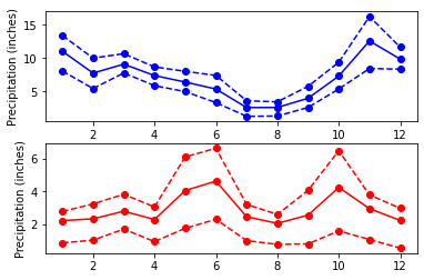
雖然累了點,很多 重複性高 的 code,但結果跟預期差不多
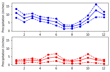
但我們有發現, y 軸的 scale 不同,所以,我可以用
plt.subplots(2, 1, sharey = True),來強制 y 軸做 share (相同 scale)
fig, ax = plt.subplots(2,1, sharey = True) # 畫出 2 列 1 行

ax[0].plot(seattle_sub["DATE"], seattle_sub["MLY-PRCP-NORMAL"], marker = "o", color = "blue")
ax[0].plot(seattle_sub["DATE"], seattle_sub["MLY-PRCP-25PCTL"], marker = "o", color = "blue", linestyle = "--")
ax[0].plot(seattle_sub["DATE"], seattle_sub["MLY-PRCP-75PCTL"], marker = "o", color = "blue", linestyle = "--")

ax[1].plot(austin_sub["DATE"], austin_sub["MLY-PRCP-NORMAL"], marker = "o", color = "red")
ax[1].plot(austin_sub["DATE"], austin_sub["MLY-PRCP-25PCTL"], marker = "o", color = "red", linestyle = "--")
ax[1].plot(austin_sub["DATE"], austin_sub["MLY-PRCP-75PCTL"], marker = "o", color = "red", linestyle = "--")

ax[0].set_ylabel("Precipitation (inches)");
ax[1].set_ylabel("Precipitation (inches)");
4.2. Time- series data
climate_change = pd.read_csv(
    "data/climate_change.csv",
    parse_dates=["date"],
    index_col = "date"
)
climate_change
| co2 | relative_temp | |
|---|---|---|
| date | ||
| 1958-03-06 | 315.71 | 0.10 |
| 1958-04-06 | 317.45 | 0.01 |
| 1958-05-06 | 317.50 | 0.08 |
| 1958-06-06 | NaN | -0.05 |
| 1958-07-06 | 315.86 | 0.06 |
| ... | ... | ... |
| 2016-08-06 | 402.27 | 0.98 |
| 2016-09-06 | 401.05 | 0.87 |
| 2016-10-06 | 401.59 | 0.89 |
| 2016-11-06 | 403.55 | 0.93 |
| 2016-12-06 | 404.45 | 0.81 |
706 rows × 2 columns
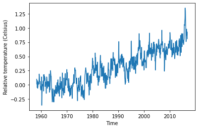
fig, ax = plt.subplots()

ax.plot(climate_change.index, climate_change.relative_temp)
ax.set_xlabel("Time")
ax.set_ylabel("Relative temperature (Celsius)")
Text(0, 0.5, 'Relative temperature (Celsius)')
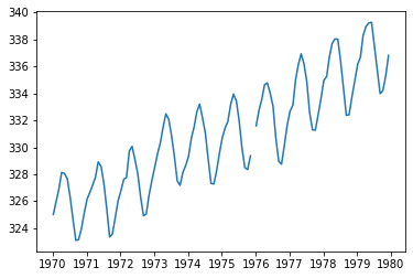
把時間軸 zoom in 一下 (因為時間現在是 index,所以可以很方便的做 subset)
fig, ax = plt.subplots()
seventies = climate_change["1970-01-01":"1979-12-31"]
ax.plot(seventies.index, seventies["co2"])
[<matplotlib.lines.Line2D at 0x122da67c0>]
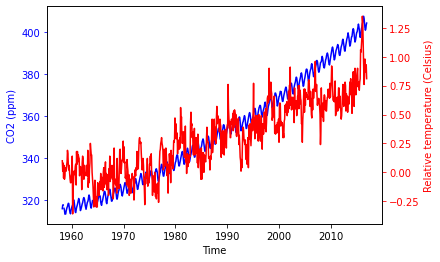
4.2.1. 雙軸圖
fig, ax = plt.subplots()
ax.plot(climate_change.index, climate_change["co2"], color = "blue")
ax.set_xlabel("Time")
ax.set_ylabel("CO2 (ppm)", color = "blue")
ax.tick_params("y", colors = "blue")

ax2 = ax.twinx()
ax2.plot(climate_change.index, climate_change["relative_temp"], color = "red")
ax2.set_ylabel("Relative temperature (Celsius)", color = "red")
ax2.tick_params("y", colors = "red")

來寫個 function,讓我們可以做得更快一點
def plot_timeseries(axes, x, y, color, xlabel, ylabel):
    axes.plot(x, y, color = color)
    axes.set_xlabel(xlabel)
    axes.set_ylabel(ylabel, color = color)
    axes.tick_params("y", colors = color)
fig, ax = plt.subplots()
plot_timeseries(
    axes = ax,
    x = climate_change.index,
    y = climate_change["co2"],
    color = "blue",
    xlabel = "Time",
    ylabel = "CO2 (ppm)"
)

ax2 = ax.twinx()
plot_timeseries(
    axes = ax2,
    x = climate_change.index,
    y = climate_change["relative_temp"],
    color = "red",
    xlabel = "Time",
    ylabel = "Relative temperature (Celsius)"
)
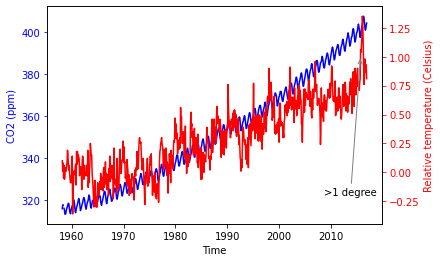
4.2.2. 加上 annotation
fig, ax = plt.subplots()
plot_timeseries(
    axes = ax,
    x = climate_change.index,
    y = climate_change["co2"],
    color = "blue",
    xlabel = "Time",
    ylabel = "CO2 (ppm)"
)

ax2 = ax.twinx()
plot_timeseries(
    axes = ax2,
    x = climate_change.index,
    y = climate_change["relative_temp"],
    color = "red",
    xlabel = "Time",
    ylabel = "Relative temperature (Celsius)"
)
ax2.annotate(">1 degree", # annotation 的文字
             xy=(pd.Timestamp("2015-10-06"), 1), # annotation 的點所在的座標
             xytext = (pd.Timestamp('2008-10-06'), -0.2), # 要顯示的文字所在的座標
             arrowprops={"arrowstyle": "->", # 箭頭,從文字指向要標記的點
                         "color": "gray"})
Text(2008-10-06 00:00:00, -0.2, '>1 degree')
4.3. Statistical plots
medals = pd.read_csv("data/medals_by_country_2016.csv", index_col = 0)
medals
| Bronze | Gold | Silver | |
|---|---|---|---|
| United States | 67 | 137 | 52 |
| Germany | 67 | 47 | 43 |
| Great Britain | 26 | 64 | 55 |
| Russia | 35 | 50 | 28 |
| China | 35 | 44 | 30 |
| France | 21 | 20 | 55 |
| Australia | 25 | 23 | 34 |
| Italy | 24 | 8 | 38 |
| Canada | 61 | 4 | 4 |
| Japan | 34 | 17 | 13 |
4.3.1. Bar chart
4.3.1.1. Simple bar chart
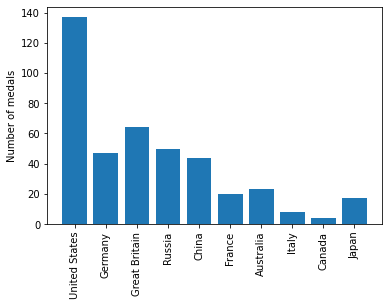
我們想畫出,各國的金牌數量
fig, ax = plt.subplots()
ax.bar(medals.index, medals["Gold"])
<BarContainer object of 10 artists>
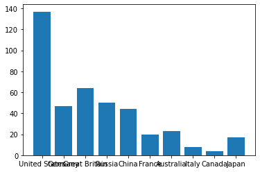
xlabel 都重疊再一起,我們把它轉 90 度
fig, ax = plt.subplots();
ax.bar(medals.index, medals["Gold"]);
ax.set_xticklabels(medals.index, rotation = 90);
ax.set_ylabel("Number of medals");
/var/folders/j9/71c8r2vs343cb9329xbww0240000gn/T/ipykernel_71988/528635632.py:3: UserWarning: FixedFormatter should only be used together with FixedLocator
  ax.set_xticklabels(medals.index, rotation = 90);
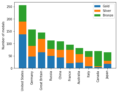
4.3.1.2. stack bar chart
我們可以做 stack bar chart
fig, ax = plt.subplots();
ax.bar(medals.index, medals["Gold"], label = "Gold");
ax.bar(medals.index, medals["Silver"], bottom = medals["Gold"], label = "Silver")
ax.bar(medals.index, medals["Bronze"],
       bottom = medals["Gold"]+medals["Silver"],
       label = "Bronze")

ax.set_xticklabels(medals.index, rotation = 90);
ax.set_ylabel("Number of medals");
ax.legend()
/var/folders/j9/71c8r2vs343cb9329xbww0240000gn/T/ipykernel_71988/3216558047.py:8: UserWarning: FixedFormatter should only be used together with FixedLocator
  ax.set_xticklabels(medals.index, rotation = 90);
<matplotlib.legend.Legend at 0x122fc2b80>
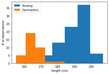
4.3.2. Histogram
tt = pd.read_csv("data/summer2016.csv", index_col = 0)
mens_rowing = tt.query("(Sex == 'M') & (Sport == 'Rowing')")
mens_gymnastic = tt.query("(Sex == 'M') & (Sport == 'Gymnastics')")
fig, ax = plt.subplots()
ax.hist(mens_rowing["Height"], label = "Rowing", bins = 5)
ax.hist(mens_gymnastic["Height"], label = "Gymnastics", bins = 5)
ax.set_xlabel("Height (cm)")
ax.set_ylabel("# of observations")
ax.legend()
<matplotlib.legend.Legend at 0x123066910>
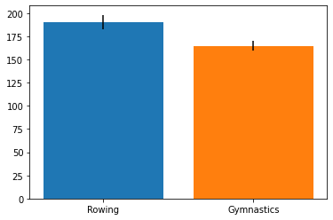
4.3.3. Error bars
幫 bar chart 加上 error bar
fig, ax = plt.subplots()

ax.bar("Rowing",
       mens_rowing["Height"].mean(),
       yerr = mens_rowing["Height"].std())
ax.bar(
    "Gymnastics",
    mens_gymnastic["Height"].mean(),
    yerr = mens_gymnastic["Height"].std()
)
<BarContainer object of 1 artists>
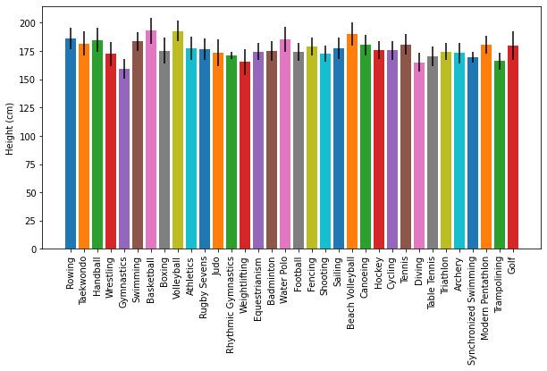
我們也可以用迴圈,畫完所有運動員的 bar chart with error bar
tt = pd.read_csv("data/summer2016.csv", index_col = 0)
sports = tt.Sport.unique()

fig, ax = plt.subplots()
fig.set_size_inches([10, 5])
for sport in sports:
    sport_df = tt.loc[tt.Sport == sport]
    ax.bar(sport, sport_df["Height"].mean(), yerr = sport_df["Height"].std())

ax.set_ylabel("Height (cm)")
ax.set_xticklabels(sports, rotation = 90)
plt.show()
/var/folders/j9/71c8r2vs343cb9329xbww0240000gn/T/ipykernel_71988/1536233426.py:11: UserWarning: FixedFormatter should only be used together with FixedLocator
  ax.set_xticklabels(sports, rotation = 90)
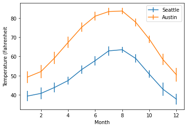
幫 line chart 加上 error bar
fig, ax = plt.subplots()

ax.errorbar(
    seattle_sub["DATE"],
    seattle_sub["MLY-TAVG-NORMAL"],
    yerr = seattle_sub["MLY-TAVG-STDDEV"],
    label = "Seattle"
)

ax.errorbar(
    austin_sub["DATE"],
    austin_sub["MLY-TAVG-NORMAL"],
    yerr = austin_sub["MLY-TAVG-STDDEV"],
    label = "Austin"
)

ax.set_ylabel("Temperature (Fahrenheit")
ax.set_xlabel("Month")
ax.legend()
<matplotlib.legend.Legend at 0x1234a0820>
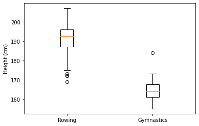
4.3.4. Boxplot
fig, ax = plt.subplots()
ax.boxplot([mens_rowing["Height"], mens_gymnastic["Height"]])
ax.set_xticklabels(["Rowing", "Gymnastics"])
ax.set_ylabel("Height (cm)")
Text(0, 0.5, 'Height (cm)')
4.3.5. scatter plot
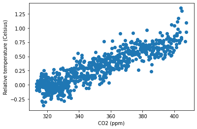
fig, ax = plt.subplots()
ax.scatter(climate_change["co2"], climate_change["relative_temp"])
ax.set_xlabel("CO2 (ppm)")
ax.set_ylabel("Relative temperature (Celsius)")
Text(0, 0.5, 'Relative temperature (Celsius)')
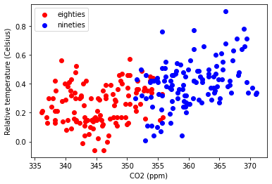
eighties = climate_change["1980-01-01":"1989-12-31"]
nineties = climate_change["1990-01-01":"1999-12-31"]

fig, ax = plt.subplots()
ax.scatter(eighties["co2"], eighties["relative_temp"],
           color = "red", label = "eighties")
ax.scatter(nineties["co2"], nineties["relative_temp"],
           color = "blue", label = "nineties")
ax.legend()

ax.set_xlabel("CO2 (ppm)")
ax.set_ylabel("Relative temperature (Celsius)")
Text(0, 0.5, 'Relative temperature (Celsius)')
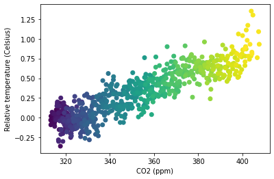
fig, ax = plt.subplots()
ax.scatter(climate_change["co2"], climate_change["relative_temp"],
           c = climate_change.index)
ax.set_xlabel("CO2 (ppm)")
ax.set_ylabel("Relative temperature (Celsius)")
Text(0, 0.5, 'Relative temperature (Celsius)')
4.4. Saving files
fig, ax = plt.subplots()

# fig.savefig("gold_medals.png")
# fig.savefig("gold_medals.jpg")
# fig.savefig("gold_medals.svg")
fig, ax = plt.subplots()
fig.set_size_inches([5, 3]) # width, height